
Imagine spending thousands of dollars driving traffic to a webpage, only to lose a large portion of your visitors before they even scroll. That’s what happens when the first visible screen fails to communicate value, build trust, or guide users toward the next step. Since first impressions form within seconds, visitors quickly decide whether a page deserves their attention or whether to leave.
That’s why above-the-fold optimization is far more than placing a headline and call-to-action at the top of a page. It combines UX, SEO, page performance, accessibility, responsive design, and conversion optimization to ensure the first viewport captures attention, loads quickly, and encourages engagement.
This guide explains what above-the-fold optimization is, why it still matters across today’s devices and screen sizes, and the best practices for creating above-the-fold experiences that improve user engagement, search visibility, and conversions.
Understanding Above-the-Fold Optimization
What Is Above-the-Fold Content?
Above-the-fold content refers to everything visible on a webpage before a visitor scrolls. It is often called the hero section, first view, or initial viewport because it is the first portion of the interface users encounter after the page finishes rendering.
What appears here depends entirely on the visitor’s device, browser dimensions, zoom level, operating system, and interface settings. There is no universal fold line or fixed pixel height anymore.
Despite this variability, the purpose is consistent: the first screen must immediately communicate meaning and direction.
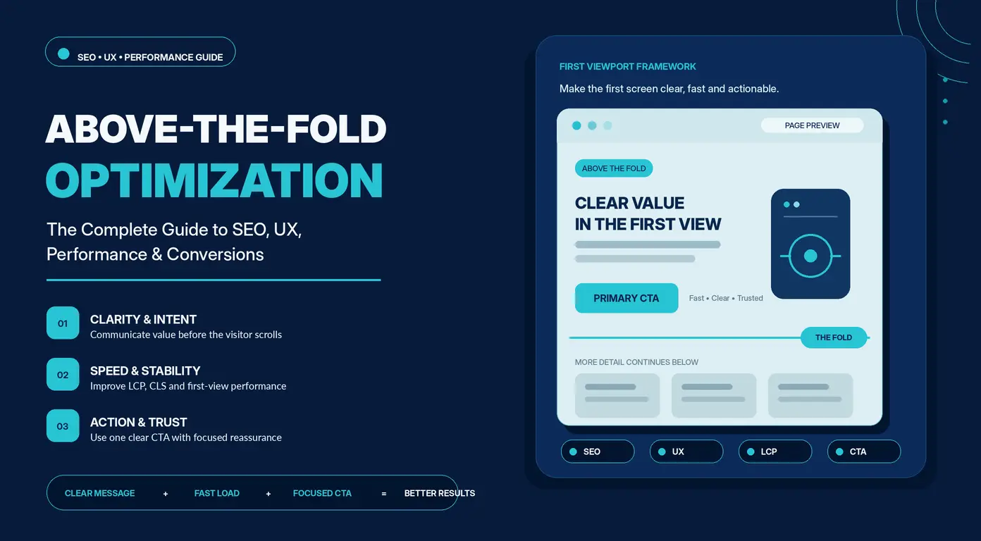
The first viewport should quickly answer:
- What is this page about?
- Why should I care?
- Can I trust this?
- What should I do next?
If users cannot understand these within seconds, engagement drops significantly. Above-the-fold optimization is not about filling space—it is about prioritizing clarity and relevance.
A well-optimized first viewport includes:
- A clear value proposition
- An informative H1
- Supporting copy
- A primary call-to-action
- Navigation
- Relevant visual assets
- Trust indicators when needed
Everything else can be revealed as users scroll.
What Above-the-Fold Content Is Not
Above-the-fold optimization is often misunderstood. It is not:
- A fixed pixel height (e.g., 600px or 768px)
- Limited to hero images or banners
- Exclusive to homepages
- A desktop-only concept
It applies to every page type—landing pages, product pages, blog posts, pricing pages, and service pages. The goal is always the same: ensure users immediately understand context and next steps regardless of device.
The Origin of the Fold: From Newspapers to Websites
The phrase “above the fold” originates from print newspapers.
Newspapers were displayed folded in half on stands, leaving only the top portion visible. Editors competed for this space because it determined whether readers would pick up the paper. Headlines, images, and key stories were placed above the fold to capture attention instantly.
Early web design adopted this concept during the desktop era when screen sizes were more predictable. Designers structured pages so that key content fit within the initial viewport.
Today, users browse on:
- Smartphones
- Tablets
- Laptops
- Large desktop monitors
- Foldable devices
- Ultrawide screens
- Split-screen windows
Instead of designing for a fixed fold, modern design focuses on creating a strong first experience across all viewports. The concept of the fold has now become dynamic.
Why the Newspaper Analogy Still Matters
Even though users can scroll freely today, the first visible screen still determines whether they continue to engage. Like newspaper headlines competing for attention, the first viewport must quickly communicate value, build trust, and encourage continuation. The medium has changed, but the psychology of first impressions has not.
Above the Fold vs. Below the Fold
The fold is not a boundary between important and unimportant content. It is a transition between immediate visibility and deeper exploration.
| Above the Fold | Below the Fold |
| Immediate visibility | Requires scrolling |
| Captures attention | Builds understanding |
| Establishes relevance | Expands detail |
| Encourages action | Supports evaluation |
| Drives clarity | Adds depth |
These sections work together rather than compete.
The user journey typically flows like this:
Above-the-fold content captures attention and communicates relevance → below-the-fold content builds understanding and trust → conversion happens when confidence is established.
Above-the-fold content introduces the message. Below-the-fold content completes it.
If everything is placed above the fold, users feel overwhelmed. If nothing meaningful appears above the fold, users lose interest.
Effective design creates a smooth progression between both.
Why the Fold Changes Across Devices
There is no fixed fold because every device and environment changes what is visible.
Screen Size
A smartphone, laptop, and desktop monitor all show different amounts of content. Even identical resolutions behave differently due to scaling and interface differences.
Browser Viewport
The viewport excludes browser chrome, toolbars, and system UI. Resized windows change what appears above the fold instantly.
Mobile vs Desktop Behavior
Desktop users can scan multiple elements at once. Mobile users scroll in a linear flow.
This changes design priorities:
- Desktop: balance and parallel scanning
- Mobile: hierarchy and clarity
Large visuals or dense navigation that work on desktop may push critical content out of view on mobile. The message must remain consistent even if the layout changes.
Responsive vs Adaptive Above-the-Fold Layouts
Responsive and adaptive design solve the same problem differently.
Responsive design uses fluid grids and flexible elements that adjust continuously to any screen size. One layout adapts dynamically. Adaptive design uses multiple fixed layouts tailored to specific breakpoints.
| Feature | Responsive | Adaptive |
| Layout behavior | Fluid and flexible | Fixed per breakpoint |
| Maintenance | Easier | More complex |
| Development cost | Lower | Higher |
| Performance | Depends on implementation | Can be highly optimized |
| Flexibility | High | Moderate |
Responsive design is the modern default because it handles device diversity more efficiently.
Adaptive design is still useful in controlled environments such as:
- Banking systems
- Enterprise dashboards
- Internal tools
- Complex applications
Regardless of approach, the goal remains identical: users should immediately understand the page’s purpose without friction.
Why Above-the-Fold Optimization Matters
The first viewport is where users decide whether to stay or leave. It directly influences engagement, scrolling behavior, conversions, and even search performance.
Creating Strong First Impressions
Users form impressions of digital interfaces within milliseconds. Before reading, they evaluate credibility, clarity, and relevance.
This judgment is shaped by:
- Typography
- Spacing
- Visual hierarchy
- Color contrast
- Imagery
- Brand consistency
- Page speed
- Message clarity
If users cannot quickly understand what the page offers, design quality becomes irrelevant. Clarity consistently outperforms aesthetics. Visitors should understand it instantly.
Improving User Experience and Engagement
The first viewport sets the mental model for the entire page.
When users immediately understand:
- Where they are
- What they can do
- What happens next
They experience less friction.
Reduced friction leads to measurable behavioral improvements:
- Longer sessions
- Deeper scrolling
- Higher interaction rates
- More page exploration
- Better retention
Good UX is not just visual decoration; it is uncertainty removal.
Every unnecessary element increases cognitive load, forcing users to process more than needed. Overloaded hero sections, competing CTAs, and unclear hierarchy all slow decision-making.
Effective above-the-fold design minimizes choices and reduces mental effort.
Driving Conversions
Conversions begin before any scroll occurs.
Whether the goal is:
- Purchasing a product
- Requesting a quote
- Downloading software
- Subscribing
- Booking a call
The first viewport establishes momentum.
High-performing hero sections typically include:
- A clear headline
- A concise value explanation
- One primary CTA
- Trust indicators
- Minimal distractions
What they avoid is equally important:
- Multiple competing CTAs
- Long introductory text blocks
- Carousels
- Autoplay media that competes for attention
Effective above-the-fold design reduces decision fatigue by guiding users toward one clear action.
How Above-the-Fold Content Influences SEO
Above-the-fold content does not directly improve rankings, but it strongly influences user behavior signals that search engines interpret as quality indicators.
Strong first impressions often lead to:
- Longer engagement
- Lower bounce rates
- More content exploration
- Higher interaction rates
Search engines also evaluate how efficiently pages render.
If critical content is delayed by heavy scripts, large media files, or render-blocking resources, both users and crawlers experience slower access to meaningful content.
Well-structured HTML, proper heading hierarchy, and optimized assets ensure faster rendering and clearer content interpretation.
Anatomy of an Effective Above-the-Fold Section
High-performing above-the-fold sections aren’t defined by a fixed layout—they’re defined by how quickly they communicate value, relevance, and next steps. Despite differences across SaaS, ecommerce, service, and content pages, strong implementations share a consistent structure.
Clear Value Proposition
The core message of the first viewport. It must instantly communicate:
- What you offer
- Who it’s for
- Why it’s different or better
Strong messaging is specific and outcome-driven, not generic.
Example:
- Weak: “Helping businesses grow.”
- Strong: “Increase organic traffic with technical SEO audits that uncover indexing, performance, and content issues affecting rankings.”
Primary Heading (H1)
The H1 reinforces relevance and should clearly restate the offer. It should be direct, not clever.
- Bad: “Welcome to the Future of Digital Growth”
- Better: “Technical SEO Audits That Find Issues Costing You Rankings”
Audience / Intent Signal
A clear “this is for you if…” statement that filters relevance early.
Examples:
- “Built for SaaS teams scaling organic acquisition”
- “For ecommerce brands struggling with product page SEO”
Supporting Copy
Brief context that reduces uncertainty by explaining:
- What’s included
- Who benefits
- Expected outcome
Keep it short—usually 1–3 sentences.
Hero Visual
A visual that reinforces meaning, not decoration.
Best options:
- Product screenshots
- Real UI or dashboards
- Service-relevant photography
- Before/after comparisons
Avoid generic stock imagery.
Prefer lightweight formats (WebP/AVIF) over heavy video to protect performance and LCP.
Primary CTA
The required next step. It should be visible, specific, and action-oriented.
Examples:
- “Start Free Trial”
- “Book a Demo”
- “Get a Quote”
Avoid multiple competing CTAs—clarity improves conversion.
Objection Handling / Micro-Reassurance
Small trust-reducing statements placed near the CTA.
Examples:
- “No credit card required”
- “Cancel anytime”
- “Takes under 10 minutes”
Trust Signals
Early credibility indicators that reduce perceived risk:
- Client logos
- Reviews and ratings
- Certifications
- Case study stats
Specific proof is stronger than vague claims:
- “Trusted by 5,000+ businesses”
Navigation
Keep minimal and familiar to avoid distraction:
- Products
- Pricing
- Resources
- Contact
Too many options reduce focus and conversions.
Optional Conversion Enhancers
Depending on page type:
- Lead forms (email capture, audit requests)
- Interactive tools (calculators, audits, configurators)
- Embedded booking widgets
These reduce friction by shortening the path to conversion.
Visual Hierarchy
A strong above-the-fold section guides attention naturally:
Value Proposition → H1 → Supporting Copy → CTA → Visual → Trust Signals
Additional reinforcement:
- Clear audience targeting improves relevance
- Strong differentiators make value tangible
- Scroll cues can encourage continuation
An effective above-the-fold section aligns message, audience, visuals, and action so visitors instantly understand without scrolling:
- What it is,
- Whether it’s for them,
- Why it matters, and
- What to do next.
Intent Alignment & SEO Relevance
Align Above-the-Fold Content with Search Intent
Above-the-fold content should immediately match what the user expected when they clicked. Informational, commercial, and transactional queries each require different first-screen priorities. If this alignment is missing, users experience instant friction and often leave without engaging further.
Meet User Intent with Clear Messaging
User intent often extends beyond the search query itself. Visitors may want to:
- compare options
- evaluate credibility
- solve a broader problem
- justify a decision to others
Strong messaging should translate these goals into outcomes rather than listing features. Outcome-driven language improves relevance and emotional clarity.
Place Keywords and Entities Naturally
Keywords should support meaning, not dominate it. Effective placement includes:
- H1 and primary headings
- opening paragraph
- key contextual sections
- image alt text (when relevant)
Use semantic entities (related terms and concepts) to strengthen topical depth without repetition or stuffing.
Build Semantic Relevance and Demonstrate E-E-A-T
Modern SEO rewards topical completeness rather than keyword density. Strengthen relevance by including:
- related workflows and use cases
- supporting tools and concepts
- practical implications and constraints
To demonstrate E-E-A-T, include:
- specific examples
- real-world trade-offs
- implementation context
- clear reasoning behind recommendations
UX Structure & Visual Hierarchy
Prioritize Information Hierarchy
Above-the-fold content must immediately communicate:
- what the page offers
- why it matters
- what the user should do next
- why the source can be trusted
If any of these are missing, users are forced to interpret instead of understand.
Optimize Heading Hierarchy
A structured heading system improves both usability and SEO clarity:
- H1 → primary topic
- H2 → major thematic sections
- H3 → supporting detail
Avoid skipping levels or overloading headings with keywords. Search engines now interpret context, not repetition.
Keep Critical Content Immediately Visible
Core value should never be hidden below the fold. The first viewport must include:
- clear value proposition
- primary CTA (or next step)
- supporting clarity (not filler text)
Avoid replacing meaning with decorative visuals or oversized banners that push content down.
Reduce Cognitive Load with Visual Hierarchy and White Space
Clarity improves when the interface is easier to scan. This is achieved through:
- adequate white space between elements
- grouping related information together
- limiting simultaneous visual emphasis
- using typographic contrast intentionally
White space is not empty, it is a structural breathing room that improves comprehension speed.
Simplify Navigation and Minimize Distractions
Every additional element competes for attention. Common distractions include:
- popups and overlays
- chat widgets in early viewport
- promotional banners
- multiple competing CTAs
If it doesn’t support the primary user goal, it reduces focus and conversion probability.
Engagement, Conversion & Accessibility
Write Effective CTAs and Supporting Microcopy
CTAs should be specific and outcome-driven rather than generic. For example, “Start Free Trial” is stronger than “Get Started.”
Supporting microcopy helps reduce hesitation:
- “No credit card required”
- “Takes less than 2 minutes”
- “Cancel anytime”
This small layer of reassurance often improves conversion more than visual redesigns.
Encourage Scrolling with Progressive Disclosure
Users should feel naturally guided downward, not forced. Progressive disclosure can be achieved through:
- partial previews of next sections
- subtle directional spacing or visual flow
- continuation-based headings
Avoid creating a “false floor” where the page feels complete too early.
Design for Mobile-First and Accessible Experiences
Above-the-fold content must function under constraints of smaller screens. Prioritize:
- concise messaging
- readable typography
- touch-friendly spacing
- fast-loading critical elements
Accessibility should also be built in:
- sufficient color contrast
- keyboard navigability
- meaningful alt text
- logical reading order
Good accessibility improves usability for all users, not just assistive technology users.
Performance Optimization for the Initial Viewport
A visually strong hero section loses its impact if users are forced to wait before anything appears. In the first seconds of a visit, performance matters more than polish. If the page feels slow, users often assume it is broken or unreliable, even if everything eventually loads correctly.
Modern hero sections are especially demanding because they combine large visuals, typography, animations, and sometimes interactive elements. The challenge is not removing these features, but delivering them in a way that doesn’t delay what users see first.
LCP: Loading the First Meaningful Element Faster
Largest Contentful Paint (LCP) measures how long it takes for the main visible element in the viewport to appear. In most cases, this is the hero image, headline, or a primary visual element. A good benchmark is 2.5 seconds or less.
When LCP is slow, the entire page feels slow—even if everything is technically loading in the background.
Common ways to improve LCP:
- Compress large media files
- Use modern formats like WebP or AVIF
- Reduce server response time (TTFB)
- Remove render-blocking resources
- Prioritize the main visible asset
In practice, reducing file size almost always has a bigger impact than optimizing delivery speed for oversized assets.
What Becomes the LCP Element
The LCP element depends entirely on layout and content structure. It is not fixed.
- Ecommerce pages → usually product images
- SaaS landing pages → dashboard or UI previews
- Blogs → featured image or sometimes the main headline
This matters because each type behaves differently.
For example:
- Images need correct sizing and compression
- Headlines depend heavily on font loading speed
- Videos are usually the heaviest and should rarely load immediately in full
A useful principle is simple: the most visually important element should also be the most optimized.
Cumulative Layout Shift (CLS)
Cumulative Layout Shift (CLS) happens when elements move unexpectedly while the page is loading. It is one of the most damaging issues for perceived quality because it breaks user trust.
Common causes include images loading without dimensions, ads injecting late, or fonts swapping after initial render.
To prevent this, the key is to reserve space before content loads.
For example:
img { width: 100%; aspect-ratio: 16/9; height: auto;}
This ensures the browser knows exactly where content will appear before it arrives.
Typical elements that should always reserve space:
- Hero banners
- Embedded media
- Ads
- Notification bars
- Widgets
Improving Responsiveness (INP)
Interaction to Next Paint (INP) measures how quickly a page responds after user input. It reflects real usability—not just load time.
Common interactions include clicking buttons, opening menus, using filters, or submitting forms. Many modern hero sections now include such components, which makes performance even more important.
The main issue is usually JavaScript blocking the main thread.
Practical improvements:
- Break long JavaScript tasks into smaller chunks
- Remove unused libraries
- Defer non-critical scripts
- Reduce DOM complexity
- Avoid excessive event listeners
Fast interfaces don’t just load quickly—they respond instantly when users interact.
Critical Rendering Path
Before anything appears on screen, the browser follows a sequence: parsing HTML, loading CSS, building the render tree, calculating layout, and painting pixels.
Any unnecessary file in this chain delays what the user sees first.
The goal is not to remove assets, but to ensure only the essentials are part of the first rendering cycle.
Critical CSS
CSS is render-blocking, which means the browser waits for it before displaying styled content.
Critical CSS solves this by isolating only the styles needed for the first viewport and loading them immediately.
This typically includes:
- Header and navigation
- Hero section
- Typography
- Primary buttons and layout structure
Everything else (like footer styles or secondary components) can load afterward without affecting first paint.
Render-Blocking Resources
Some files delay rendering even if they are not essential for the first screen.
Common examples:
- Large CSS frameworks
- Font libraries
- Animation and slider scripts
- Third-party marketing tools
The key decision rule:
If it doesn’t affect the first viewport, it should not block rendering.
Common fixes:
- Async or defer JavaScript
- Code splitting
- Tree shaking
- Removing unused CSS
Many sites discover that a large portion of their JavaScript is never used during initial load.
Optimizing Hero Images
Hero images are often the largest contributor to page weight and LCP delays, so they deserve special attention.
Best practices:
- Use AVIF or WebP formats
- Resize to actual display dimensions
- Compress aggressively without visible quality loss
- Serve via CDN
- Avoid embedding text inside images
- Use responsive image variants
A useful enhancement is the Low-Quality Image Placeholder (LQIP), where a blurred version loads instantly and is replaced by the full image once ready. This improves perceived speed significantly.
Fonts and Perceived Performance
Fonts strongly influence how fast users perceive a page to load.
Poor font handling can cause invisible text, unstyled flashes, and layout shifts.
Improvements include:
- Limiting font families
- Using fewer font weights
- Preloading critical fonts
- Using font-display: swap
- Hosting fonts locally when possible
Variable fonts can also reduce file count by replacing multiple font files with a single flexible one.
Prioritizing Critical Assets
Browsers don’t always prioritize correctly, so developers can guide them.
Two key tools:
Preload
Used for assets that must load early:
- Hero images
- Fonts
- Critical CSS
- Essential JavaScript
Fetch Priority
<img src=”hero.avif” fetchpriority=”high” alt=”Hero image”>
This ensures the most important visual element is loaded first.
Avoid Misusing Lazy Loading
Lazy loading improves performance—but only when applied correctly.
It should never be used for anything visible in the initial viewport.
Good use cases:
- Below-the-fold images
- Galleries
- Testimonials
- Recommendations
Bad use cases:
- Hero images
- Above-the-fold visuals
- Primary banners
Lazy loading is about delaying non-critical content, not delaying first impressions.
Optimizing Above-the-Fold Content by Page Type
No single above-the-fold layout works universally.
Each page type serves a different user intent, so the first viewport must reflect that intent clearly. A homepage introduces a brand, a product page supports evaluation, and a blog post delivers information. Treating them the same creates friction and reduces clarity.
Effective above-the-fold design always aligns with the page’s primary conversion goal—whether that is exploration, sign-ups, purchases, or trust-building.
Homepage
Homepages attract mixed intent traffic. Some users are discovering the brand for the first time, while others are searching for specific services, pricing, or support.
The above-the-fold section should immediately clarify what the business does and guide users toward exploration without overwhelming them.
Prioritize:
- Clear value proposition
- One primary CTA
- Simple navigation
- Relevant hero visual
- Trust signals (client logos, user counts, recognitions)
Avoid turning the homepage into a catalog. Listing everything upfront dilutes focus. Instead, guide users deeper into the site based on their intent.
Landing Pages
Landing pages are built around a single objective: conversion.
Whether it’s lead generation, webinar sign-ups, or free trials, every above-the-fold element should reinforce one action and remove distractions.
High-performing landing pages typically include:
- Benefit-driven headline
- Brief supporting copy
- One strong CTA
- Social proof (testimonials, ratings, logos)
- Minimal or no navigation
- Clean, distraction-free layout
Consistency is critical. The message above the fold should closely match the ad, email, or search result that brought the visitor in. Any mismatch introduces doubt and reduces conversions.
Ecommerce Product Pages
Product pages answer purchase-related questions quickly and visually.
Users typically want immediate clarity on:
- What the product is
- Why it’s worth buying
- Price and availability
- Trust signals
A strong above-the-fold section reduces hesitation by surfacing key information early.
Key elements:
- High-quality product image
- Product title and price
- Primary purchase CTA (Add to Cart / Buy Now)
- Ratings and review count
- Key highlights (shipping, returns, availability)
- Variant selection (if applicable)
Performance matters significantly here. Product images often become the Largest Contentful Paint element, so image optimization directly impacts perceived speed and conversion rates.
SaaS Websites
SaaS visitors evaluate utility before design. They need to quickly understand what the product does and why it matters.
The hero section should clearly communicate:
- What the software does
- Who it is for
- What problem it solves
Instead of abstract visuals, showing the actual product builds faster comprehension and trust.
Effective above-the-fold elements include:
- Product dashboard screenshots
- Short product walkthroughs or demos
- Explainer videos
- Customer logos
- Security or compliance badges
- Free trial CTA
Small reassurance cues can significantly reduce hesitation, such as:
“No credit card required” or “Cancel anytime.”
Service Pages
Service pages are trust-driven. Users are evaluating credibility, expertise, and relevance before taking action.
The first viewport should immediately establish authority and clarity.
Include:
- Outcome-focused headline
- Clear description of the service
- Professional imagery
- Testimonials or reviews
- Certifications or trust badges
- Primary contact CTA
For local services, specificity matters.
Instead of a generic headline like “Plumbing Services”, use something like “24/7 Emergency Plumbing Services in Chicago”. This improves both clarity and local intent alignment.
Blog Posts
Blog readers arrive with a single goal: finding answers. Above-the-fold content should respect that intent and avoid unnecessary distractions.
The focus should be clarity, readability, and orientation.
Helpful elements include:
- Clear H1 headline
- Brief introduction or context
- Estimated reading time
- Featured image (optional)
- Table of contents (for long-form content)
Avoid aggressive promotions or conversion-heavy elements at the top. Trust is built first by delivering relevance. Conversions can follow naturally once intent is satisfied.
Local Business Websites
Local businesses operate on immediacy. Users often arrive with urgent intent and expect quick access to essential information.
The above-the-fold section should remove friction and make contact effortless.
Key information:
- Business name and core service
- Location or service area
- Phone number (click-to-call)
- Opening hours (if relevant)
- Primary CTA (Call, Book, Directions)
- Reviews or rating signals
On mobile, click-to-call and directions should be immediately accessible. The easier it is to act, the higher the conversion rate.
Measuring and Improving Above-the-Fold Performance
Optimization doesn’t stop once a page goes live.
User behavior rarely matches initial design assumptions, which makes continuous measurement essential. The only reliable way to improve above-the-fold performance is by observing how real visitors interact with it.
Scroll Depth
Scroll depth measures how far users move down a page.
Low scroll depth isn’t automatically a problem. Some pages are designed to resolve intent immediately in the first viewport. However, when users consistently fail to progress on long-form pages or key landing pages, it signals a potential issue in the above-the-fold experience.
Common causes include:
- Weak or unclear value proposition
- False floor effect (users think content ends early)
- Poor visual hierarchy
- Slow initial load
- Misaligned messaging
Scroll behavior helps pinpoint where attention drops and whether users feel motivated to continue.
Heatmaps, Click Maps, and Session Recordings
Traditional analytics show what happened. Behavioral tools explain why it happened.
Heatmaps reveal where users focus attention, including clicks, hovers, and interaction density. They help identify whether important elements are being noticed or ignored.
Click maps highlight usability issues such as:
- Non-clickable elements being repeatedly clicked
- Underperforming CTAs
- Unexpected interaction patterns
- Confusing UI structure
Session recordings add qualitative depth by showing real user journeys. They often reveal friction that analytics alone cannot explain, such as hesitation, repeated attempts, or navigation confusion.
Engagement Metrics
No single metric captures engagement accurately. Interpretation requires context and a combination of signals.
Key indicators include:
- Average engagement time
- Engaged sessions
- Pages per visit
- Scroll completion rate
- Return visitors
- CTA interaction rate
A shorter session is not necessarily negative if the user completes their goal quickly. The key is whether intent is successfully fulfilled, not time spent.
Conversion Rate
Above-the-fold optimization ultimately exists to improve measurable outcomes.
Track conversions aligned with business goals, such as:
- Purchases
- Newsletter sign-ups
- Form submissions
- Demo requests
- Free trial activations
- Quote requests
- Phone calls
Improvements should always be validated through before-and-after comparison. Without this, it’s impossible to determine whether changes actually improved performance or only altered appearance.
Core Web Vitals
Core Web Vitals provide a structured way to evaluate first-view performance from a technical perspective.
Monitor:
- Largest Contentful Paint (LCP)
- Cumulative Layout Shift (CLS)
- Interaction to Next Paint (INP)
Strong scores don’t guarantee good UX, but poor scores almost always indicate friction in perceived performance. For accurate evaluation, combine lab data with real-user metrics, since real-world conditions often differ significantly from tests.
A/B Testing Framework
Optimization works best as an ongoing, incremental process rather than large redesigns.
Instead of changing entire layouts, test one variable at a time, such as:
- Headlines
- CTA copy
- Hero visuals
- Button placement
- Trust signals
- Layout structure
- Supporting messaging
Controlled experiments isolate impact and prevent misleading conclusions. While full redesigns may look impactful, smaller iterative improvements usually produce more consistent long-term gains.
Common Above-the-Fold Mistakes
Below are the most frequent issues that reduce clarity, performance, and conversions.
| Mistake | What Goes Wrong | Better Approach |
| Trying to fit everything above the fold | Cluttered hero with competing messages, CTAs, and visuals | Focus on one clear message and one primary CTA |
| Oversized hero sections | Pushes key content below the fold, especially on mobile | Keep hero compact and immediately meaningful |
| Weak or generic headlines | Vague messaging creates confusion | Use specific, outcome-driven headlines |
| Hidden value proposition | Core message buried under visuals or animations | Make value proposition immediately visible |
| Multiple competing CTAs | Users are forced to choose without clarity | Use one dominant CTA, others secondary |
| Slow hero images | Increases LCP and delays perception of content | Compress images and optimize formats |
| Poor mobile experience | Layout breaks, elements overlap, usability drops | Design mobile-first and test across devices |
| Layout shift issues | Elements move unexpectedly during load | Reserve space for all dynamic content |
| Intrusive pop-ups | Interrupts users before understanding page | Delay until engagement occurs |
| Prioritizing design over clarity | Beautiful UI hides key information | Ensure clarity always comes first |
Conclusion
Above-the-fold optimization is no longer just a design concern—it sits at the intersection of UX, SEO, performance, and conversions. The first viewport must communicate value quickly, build trust, load fast, and guide users toward a clear next step without creating friction or overload.
High-performing pages don’t win by showing more—they win by showing only what matters. A clear value proposition, strong visual hierarchy, fast-loading assets, and a focused CTA work together to create immediate clarity.
While the “fold” will continue to shift across devices and screen sizes, the principle stays the same: if users understand the page within seconds, everything else improves—engagement, conversions, and visibility.
Frequently Asked Questions
What is the above-the-fold concept?
Above the fold refers to the portion of a webpage visible before a user scrolls. It represents the first impression visitors receive and typically contains the headline, value proposition, navigation, hero section, and primary call-to-action.
Does above-the-fold content affect SEO?
Not directly through placement alone. However, above-the-fold optimization influences several factors that contribute to SEO, including page experience, Core Web Vitals, content accessibility, user engagement, and semantic clarity.
Is above the fold still relevant?
Absolutely.
While the fold varies across devices, the first viewport remains the most influential part of the user journey. Visitors still form immediate judgments based on what they initially see.
Where does the fold appear on different devices?
There isn’t a fixed location.
The fold changes according to:
- screen size,
- viewport dimensions,
- browser window,
- zoom level,
- operating system,
- interface settings,
- responsive layout behavior.
Modern optimization focuses on adaptable experiences rather than fixed pixel heights.
Should every important element be above the fold?
No.
Trying to place everything in the initial viewport often creates clutter and increases cognitive load. Prioritize essential information first, then reveal supporting content progressively as users scroll.
Should CTAs always appear above the fold?
For most commercial pages, yes.
Visitors should immediately understand the next available action.
Long-form educational content may introduce additional CTAs later, but placing at least one clear primary CTA within the first viewport generally improves usability and conversions.
How much content should be above the fold?
Enough to answer four questions:
- What is this page?
- Why should I care?
- Can I trust it?
- What should I do next?
Everything else should expand naturally below the fold.
Which metrics indicate successful above-the-fold optimization?
Evaluate both technical and behavioral metrics, including:
- Largest Contentful Paint (LCP)
- Cumulative Layout Shift (CLS)
- Interaction to Next Paint (INP)
- Scroll depth
- Engagement time
- Conversion rate
- Heatmap interactions
- Click-through rate on primary CTAs
Looking at multiple metrics together provides a far more accurate picture than relying on a single KPI.