
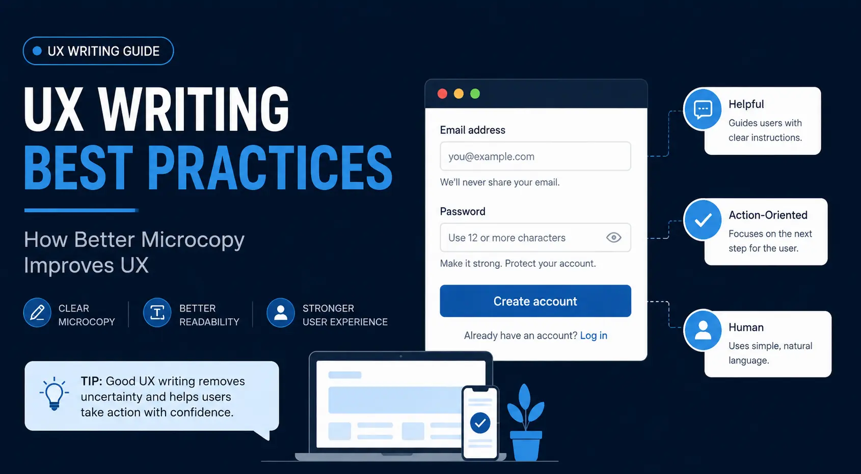
A button that says “Submit” doesn’t tell users what to expect next. “Create account,” “Save changes,” or “Download report” tells them what will happen next. That small difference is UX writing in practice.
The strongest UX copy doesn’t try to sound clever. It removes uncertainty at the exact moment a user needs help. Good microcopy has to account for intent, cognitive load, visual hierarchy, accessibility, and the user’s next action, not just sentence length.
Clear language also matters beyond individual product screens. Accessibility guidance increasingly treats understandable content, predictable interaction, and error prevention as part of usable design.
What UX Writing Actually Means and Why It Goes Beyond “Writing Simply”
UX writing is the practice of creating the words users interact with inside a digital product or experience. That includes buttons, labels, navigation, form instructions, notifications, warnings, empty states, confirmation messages, onboarding screens, and errors.
Microcopy is one part of that larger discipline. Think of the difference this way:
| UX writing | Microcopy |
| Covers the broader content experience | Usually refers to short interface text |
| Includes flows, instructions, navigation, onboarding, and system feedback | Includes buttons, labels, hints, errors, and small prompts |
| Considers the complete user journey | Solves a specific moment of interaction |
UX writing is also different from conventional marketing copywriting. A landing page headline can persuade someone to buy, but the checkout button needs to make the next step obvious.
The distinction matters because a product can have excellent marketing copy and terrible UX writing. A persuasive headline won’t save a signup form that doesn’t explain why a phone number is required.
This pattern appears frequently in interface reviews: teams spend a lot of time refining prominent marketing copy while leaving “Continue,” “Invalid input,” and “Something went wrong” untouched. Yet the copy closest to the user’s actual decision has the greatest effect on whether they can move forward.
Where User Experience Text Influences Decisions
UX text appears at moments of uncertainty:
- Before an action: What will happen if I select this?
- During an action: What information do I need?
- After an action: Did it work?
- When something fails: What went wrong?
- When a user hesitates: Is this safe?
- When a user gets stuck: What should I do next?
That makes UX writing a functional part of the interface, not decorative text added after design is finished.
UX Writing Best Practices for Clear, Action-Oriented Microcopy
The basic rule is simple:
Write for the user’s next decision, not for the company’s preferred wording.
That changes how you approach almost every interface element.
Write CTAs Around the User’s Next Action
“Submit” is technically correct, but it describes the form rather than the user’s goal.
Compare:
| Weak | Better |
| Submit | Create account |
| Continue | Review order |
| Learn more | See pricing |
| Confirm | Book appointment |
The stronger version gives the user an expectation about what comes next.
That doesn’t mean every button needs to become a mini-sentence. Short labels are best when the action is already obvious. The point is specificity, not length.
Replace Vague Labels With Specific Instructions
A useful test is to remove the surrounding interface and read the button or link on its own.
- Would “Click here” still make sense?
- Would “More information” tell users what information they’re about to see?
- Would “Next” tell them where the process is going?
Meaningful link and button text also supports accessibility. W3C guidance recommends descriptive link text, informative headings, clear instructions, and concise language as part of accessible web writing.
Keep Microcopy Useful, Not Merely Short
“Be concise” is good advice until it is applied mechanically. Consider a password field.
Too little information:
Password
More useful:
Password
Use 12 or more characters.
The second version is longer, but it will prevent an error. That’s the important distinction:
The objective is not to make the UX brief but to reduce uncertainty and the chances of error.
Good microcopy gives users the information to fully understand what is happening and complete the task without adding unnecessary cognitive effort.
How Readability Affects User Experience
Readability isn’t just about whether someone can understand a sentence after reading it. Interface users aren’t reading carefully.
They’re scanning a screen, comparing options, looking for confirmation, checking whether a field is required, or trying to recover from an error.
That’s why a readability score should be treated as a diagnostic signal and not a final quality score.
Readability Scores: What Flesch-Kincaid Can and Can’t Tell You
The readability formulas include:
- Flesch Reading Ease
- Flesch-Kincaid Grade Level
- Gunning Fog Index
- SMOG
- Coleman-Liau Index
These formulas use factors such as sentence length, word length, syllables, or character counts. They’re useful for identifying obvious complexity. If a two-line tooltip produces a grade level associated with advanced academic writing, the wording probably deserves another look.
But readability formulas don’t understand interface context.
They can’t tell whether:
- a button label matches the user’s mental model;
- a warning appears at the right time;
- an instruction is visually attached to the correct field;
- terminology matches the product;
- a familiar technical term is actually clearer for the intended audience;
- the user understands what happens after selecting an action.
A short sentence can be terrible UX.
“Process unavailable.”
That’s easy to read, but it doesn’t tell the user what happened or what to do next.
Cognitive Load Matters More Than Word Count
Users have limited attention, particularly when completing unfamiliar or high-stakes tasks.
Imagine an insurance form asking:
“Please provide the relevant identification number associated with your policy documentation.”
A clearer version might be:
“Enter your policy number.”
The second sentence isn’t easier because it contains fewer words, but it reduces the interpretation required before the user can act.
W3C cognitive accessibility guidance recommends easy-to-understand language, unambiguous content, manageable text blocks, and clear visual separation because these choices make information easier to process.
Design Copy for Scanning
Good UX writing works with visual hierarchy.
Instead of:
Please enter your billing address in the fields below. Make sure that the address you provide matches the address associated with your payment method before continuing with your purchase.
Use:
Billing address
Enter the address linked to your payment method.
[Address fields]
That structure provides:
- A clear heading.
- One relevant instruction.
- The required fields.
- A visible path forward.
The writing and layout are doing the same job.
Error Messages That Help Users Recover
An error message shouldn’t just announce failure. Its job is to help the user recover.
A useful pattern is:
What happened + where it happened + how to fix it
For example:
Weak:
Invalid input.
Better:
Enter a valid email address, such as name@example.com.
The second message answers the user’s immediate question without forcing them to investigate the interface.
The GOV.UK Design System recommends specific error messages that explain the problem and tell users how to fix it, rather than relying on vague messages such as “An error occurred.”
Explain What Went Wrong Without Blaming the User
Avoid:
You entered an invalid date.
Prefer:
Enter a date in DD/MM/YYYY format.
The second version focuses on resolution rather than blame.
Errors also shouldn’t rely on color alone. A red border may reinforce an error state, but the message is required to tell what is wrong. WCAG 2.2 requirements around understandable content, input assistance, and visual presentation reinforce the need for error states that users can perceive and act on.
Give Users a Clear Recovery Path
A strong error message should answer:
“What do I do now?”
For example:
Payment failed
Your bank declined the transaction. Check your card details or try another payment method.
That’s more useful than:
Payment error. Please try again.
The first message provides a diagnosis and recovery options. The second pushes the user toward repeating the same action without explaining what needs to change.
Onboarding Flows: Write for Users Who Don’t Know the Product Yet
Onboarding is where companies explain too much.
A new user doesn’t need a complete product manual. They need enough information to make the next decision confidently.
Consider a project-management application. A single onboarding screen could attempt to introduce:
- workspaces;
- teams;
- projects;
- tasks;
- integrations;
- automations;
- permissions;
- dashboards;
- notifications.
That’s a lot of unfamiliar information before the user has accomplished anything.
A better sequence might ask:
What are you working on?
Then:
Who are you working with?
Then:
Create your first project
Each screen earns the next piece of information.
Reduce Friction at Each Step
Ask whether each onboarding message answers a real question. If the user hasn’t encountered a feature yet, don’t explain its advanced settings. If a step is optional, make that clear.
For example:
Add teammates
Invite people who’ll work with you.
Skip for now
That final option reduces uncertainty because the user knows they aren’t committing to an irreversible decision.
Use Progressive Disclosure
Progressive disclosure means showing information when it becomes useful rather than presenting everything at once. It’s valuable in complex products.
A settings page doesn’t need to explain every advanced option immediately. A short label to introduce the control, while context to provide additional detail when needed.
The principle is to show the right information at the right moment.
Turn Empty States Into Useful Guidance
An empty state shouldn’t just say:
No projects.
That’s technically accurate, but it doesn’t help the user continue.
A stronger version is:
No projects yet
Create your first project to start organizing your work.
Create project
Now the interface communicates the current state and the next action. That’s UX writing doing product work.
Voice and Tone Frameworks for Consistent UX Copy
Voice is the personality of the product, and tone changes as per the situation.
A banking app might use a calm, reassuring tone during a payment failure and a more neutral tone in account settings. A gaming app can be playful during onboarding, but that playfulness becomes inappropriate when explaining a security warning.
Create Context-Specific Voice Rules
A useful voice framework defines:
We are:
- clear;
- direct;
- respectful;
- confident.
We aren’t:
- sarcastic;
- overly technical;
- unnecessarily formal;
- vague.
Then define how the tone changes by context:
| Situation | Tone |
| Successful action | Positive, brief |
| Error | Calm, specific |
| Security warning | Serious, direct |
| Onboarding | Encouraging |
| Legal requirement | Precise |
| Empty state | Helpful |
When Friendly Copy Becomes Unclear
There’s a point where personality gets in the way. Imagine a financial application saying:
Uh-oh! Your payment took a little detour. Let’s give it another whirl!
It sounds friendly but also hides useful information.
A clearer version:
Payment failed
Your bank declined the transaction. Try another card or contact your bank.
Good UX writing doesn’t eliminate personality. It puts usability first.
Accessibility and Localization in UX Writing
Accessibility should be considered while writing interface copy, not added during the final QA pass.
WCAG 2.2 includes requirements and guidance related to understandable content, predictable interactions, input assistance, focus, target size, authentication, and other aspects of usable interfaces.
Use Plain Language Without Oversimplifying
Plain language doesn’t mean childish language. It means choosing language that communicates the intended meaning without unnecessary complexity.
Instead of:
Authentication credentials could not be validated.
Use:
We couldn’t sign you in. Check your email and password.
Instead of:
Before initiating the transaction, please ensure sufficient funds are available.
Use:
Make sure you have enough money before paying.
W3C writing guidance recommends clear sentences and paragraphs, meaningful headings, useful instructions, descriptive link text, and appropriate list formatting.
Write for Screen Readers
Visual context isn’t always available. A message such as the one below depends on location and color for meaning.
Click the red button below.
The better message is:
Select Delete account to permanently remove your account.
The text itself now carries the instruction.
Avoid Language That Breaks in Translation
Localization exposes weaknesses that aren’t obvious in English.
Common problems include:
- idioms;
- jokes;
- gender assumptions;
- concatenated sentences;
- text embedded in graphics;
- hard-coded dates;
- unexplained abbreviations;
- phrases whose meaning depends heavily on word order.
“Your cart is on fire!” might work as playful English copy. Translating the words literally doesn’t guarantee the same meaning or tone elsewhere.
Readability Testing and UX Copy Evaluation
A readability score indicates a paragraph’s complexity. It can’t tell you whether that paragraph should exist.
Evaluating UX copy therefore requires more than running text through a readability calculator.
Combine Readability Scores With Human Review
A practical review uses three layers.
Layer 1: Language
Check:
- sentence length;
- complex words;
- jargon;
- unnecessary qualifiers;
- passive constructions;
- reading level.
Layer 2: Interface context
Check:
- Is the copy visible at the right moment?
- Is it close to the element it explains?
- Does the heading establish hierarchy?
- Is the CTA specific?
- Can the user scan it?
Layer 3: User outcome
Check:
- Did users complete the task?
- Did they make fewer mistakes?
- Did support requests decrease?
- Did users understand the next action?
- Did completion or conversion improve?
What to Measure Beyond Grade Level
Useful UX writing metrics include:
- task completion rate;
- form error rate;
- abandonment rate;
- time to completion;
- repeated clicks;
- help-center usage;
- support tickets;
- successful onboarding completion;
- CTA interaction;
- user comprehension during testing.
These measures connect copy decisions to actual user and business outcomes rather than judging wording in isolation.
How to Evaluate UX Writing Quality
Competitor analysis provides context, but copying the wording of another product or ranking page isn’t useful.
Instead, compare the experience the copy creates.
Useful evaluation criteria include:
| Area | What to evaluate |
| Readability | Whether complexity matches the audience |
| CTA clarity | Whether actions describe meaningful outcomes |
| Scannability | Whether users can locate key information quickly |
| Error recovery | Whether messages explain how to continue |
| Accessibility | Whether meaning survives without visual cues alone |
| Examples | Whether guidance demonstrates real interface patterns |
| Visual hierarchy | Whether copy works with headings, spacing, and layout |
| Comprehension | Whether users understand what happens next |
| Task completion | Whether the copy supports successful outcomes |
Don’t treat a lower reading level as an automatic win.
A technical audience may need precise technical terminology. Removing familiar terms simply to achieve a lower grade level can make an interface harder, and not easier to understand.
The better question is:
Does the language match the user’s task and knowledge level?
Content Depth: What Separates Useful UX Writing Guidance From Thin Advice
One of the easiest ways to create superficial UX writing guidance is to stop at recommendations such as:
Keep your copy short.
Use simple words.
Be consistent.
Know your audience.
Test your content.
The problem with these recommendations is that they don’t tell a practitioner what to do in a real interface.
What Comprehensive Microcopy Guidance Should Cover
Strong UX writing guidance addresses areas such as:
- CTA patterns;
- form labels;
- helper text;
- error messages;
- validation;
- onboarding;
- empty states;
- confirmation messages;
- notifications;
- accessibility;
- localization;
- voice and tone;
- terminology;
- readability;
- testing;
- measurement.
It should also explain when a rule doesn’t apply. For example, “always use active voice” is simplistic. The better question is whether the sentence clearly communicates responsibility and action.
Signs of Superficial UX Writing Advice
Watch for guidance that:
- gives rules without examples;
- recommends “simple language” without defining the audience;
- treats microcopy as the entire field of UX writing;
- discusses readability without context;
- ignores accessibility;
- ignores localization;
- never discusses errors or recovery;
- focuses on word count rather than user outcomes;
- repeats generic copywriting advice.
A useful test is:
Could a designer implement the recommendation after reading it?
If the answer is no, the guidance probably needs more practical detail.
Evaluate Cognitive Load and Practical UI Patterns
Consider a checkout form.
Advice such as “make the copy concise” doesn’t tell the team whether security reassurance belongs:
- beside the card field;
- under the payment button;
- in a tooltip;
- on the confirmation screen.
That’s where content design becomes useful. Wording, location, timing, hierarchy, and interaction pattern all affect comprehension.
Common UX Writing Mistakes That Show Up in Product Interfaces
Even well-designed interfaces become difficult to use when the copy introduces uncertainty, reflects internal terminology, or fails to guide recovery. These common mistakes are worth checking during a UX content review.
| Mistake | Why It Creates Problems | Better Approach |
| Writing for the system instead of the user | Technical messages such as “Authentication failed” reflect system terminology rather than the user’s task. | Use language that matches what the user is trying to do, such as “We couldn’t sign you in.” |
| Treating shorter as automatically better | Removing useful context can increase confusion or errors. | Keep the information users need to understand the action or avoid a predictable mistake. |
| Using generic CTAs everywhere | Labels such as “Continue” force users to inspect surrounding content to understand what happens next. | Use outcome-oriented labels such as “Review order” or “Create account” when the next step isn’t obvious. |
| Making errors sound like technical logs | Internal exception names or vague system messages don’t tell users how to recover. | Explain what went wrong and provide a clear recovery path. |
| Adding personality where clarity is critical | Humor or playful language can obscure important information during payments, security warnings, or destructive actions. | Match the tone to the consequences of the interaction and prioritize clarity in high-stakes moments. |
| Writing copy after the interface is finished | Treating copy as final polish can create awkward wording and layouts that don’t support the content. | Consider copy during interaction design so wording, hierarchy, space, and behavior work together. |
| Optimizing wording without testing the outcome | Polished copy doesn’t prove that users understand the interface or can complete the task. | Test comprehension, task completion, errors, and whether users understand what happens next. |
Practical UX Writing Checklist Before Publishing or Shipping UI Copy
Before approving UX copy, ask:
- Does the copy tell the user what they need to know at this moment?
- Is the next action obvious?
- Does the CTA describe the actual outcome?
- Have unnecessary words been removed?
- Are important instructions easy to scan?
- Does the language match the user’s knowledge level?
- Does terminology remain consistent throughout the product?
- Do error messages explain both the problem and the recovery path?
- Can assistive technologies interpret the meaning?
- Does the copy avoid relying on color or visual context alone?
- Will the wording remain understandable when translated?
- Has the copy been reviewed inside the actual interface rather than in isolation?
- Has it been tested against a real user task?
- Is there evidence that the copy improves comprehension or task completion?
That final question is what the teams overlook.
Conclusion: Good UX Writing Reduces the Work Users Have to Do
The best UX writing practices aren’t about making every sentence shorter. They’re about making the interaction easier to understand.
A good CTA removes hesitation. A useful error message gives users a way forward. Effective onboarding introduces information when it becomes relevant. Accessible language makes meaning available to more people, while readability testing exposes unnecessary complexity.
The final test is the user’s experience. If people hesitate, make avoidable mistakes, repeatedly seek help, or abandon a task, inspect the words alongside the design. The biggest UX writing problems are not grammatical, but problems of timing, context, hierarchy, and missing information.
FAQs About UX Writing Best Practices
What Are the Best Practices for UX Writing?
Focus on clarity, context, consistency, accessibility, and action. Give users the information they need at the moment they need it, then test whether the copy improves comprehension and task completion.
What Makes Microcopy Effective?
Effective microcopy supports a specific action or answers an immediate question. It reduces uncertainty without adding unnecessary information.
What Readability Score Should UX Copy Target?
Readability scores flag unnecessary complexity, but the appropriate level depends on the audience, task, terminology, and interface context.
How Is UX Writing Different From Copywriting?
UX writing helps users understand and complete tasks inside a product. Copywriting focuses more on persuasion, positioning, and conversion, although the two disciplines overlap.
How Do You Measure Whether UX Writing Is Working?
Measure user outcomes such as task completion, form errors, abandonment, time to completion, support requests, and comprehension during usability testing. The strongest evidence is whether users can complete the intended task with less confusion.